The
Eden project
Textile designer
Kim Parker's Manhattan pad doesn't have a garden. But she doesn't
need one - her home's filled with her large, floral prints.
By Charlotte
Abrahams. Photographs by Albert Vecerka
Saturday
October 22, 2005
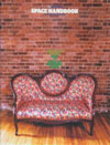
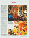
Welcome to what is probably the most boldly floral interior you
have ever seen. It belongs to American artist and textile designer
Kim Parker, best known in this country for her award-winning and
extremely floral Mums And Asters rug. It is situated not in the
cosy, rural idyll you might expect, but on the first floor of a
19th- century brownstone block in downtown Manhattan. There isn't
even a balcony. But that suits Parker just fine. "I'm a city
girl," she says. "I garden with paint, not soil."
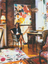
Parker and her husband Felipe Porto moved into this modestly sized
apartment near New York's flower market four years ago. Their previous
home was an industrial loft in the city's fashion district but,
although it was big enough for Parker to "dance around in socks",
it never felt like home. And, for Parker, homeliness - by which
she means being surrounded by things with a history - is worth a
lot more than an impressive square footage. So, seduced by the original
wooden floors, old marble fireplaces and exposed brickwork of this
landmark brownstone, the couple put a lot of stuff into storage
and downsized. They haven't looked back.
"The feng shui here is not to be paralleled," Parker says.
"The space embraces us as soon as we walk in."
Did you train as a designer? No, I trained as a
flautist. It wasn't until my late 20s that I started to think about
a career in design. I'd graduated with a BA in music in 1985, then
in 1987 I took my first two painting classes - one in colour theory
and one in oil painting. After a brief time teaching and playing
music in Belgium, I switched to design. My first job was as a colourist
in the fashion and textile industry.
Where did you develop your talent for working with colour
and prints? By the time I was four, I was producing literally
hundreds of bookmarks with tiny floral and geometric patterns on
them. I don't know where it came from, other than that my parents
were talented artists and musicians, and very early on they introduced
me to painters such as Vuillard, Bonnard and Matisse. I was in awe
of these painters' abilities to combine densely populated patterns
on wallpapers, rugs and upholstery in a room to the point where
you couldn't easily identify the figure. I think my understanding
of the interplay between colour and pattern comes from my familiarity
with paintings, fabric designs and even music, since music involves
an understanding of rhythm and dissonance.
Don't you worry about clashing? My mantra is, if
it makes you happy, go for it. Think of your furniture as canvases
for new prints. Large pieces should always be covered in large prints,
but I think small things such as footstools look better with big
prints, too - dainty prints are just so timid. Footstools make ideal
accent pieces for people who are a bit nervous about using bold
prints.
You don't ever long for a whole wall of factory grey, then?
For me, colour is like a vitamin, or even a drug: it fills me with
energy and brings in so much healing. It's colour rather than flowers
that is the driving force for me - I wouldn't care about flowers
if they didn't have colour.
How do you compose a room? When I create a room,
I like to start with a plain piece of furniture and then layer the
prints in around it. Once the big things such as the furniture and
the rugs are settled, the fun really begins - I can slowly add the
quirky, colourful, eclectic accents that playfully interact. Little
by little, I create patterned offshoots with more patterns on cushions
or paintings. What comes to mind is Ravel's Bolero, where each instrument
comes in one by one, gradually creating rich layers of sound. |