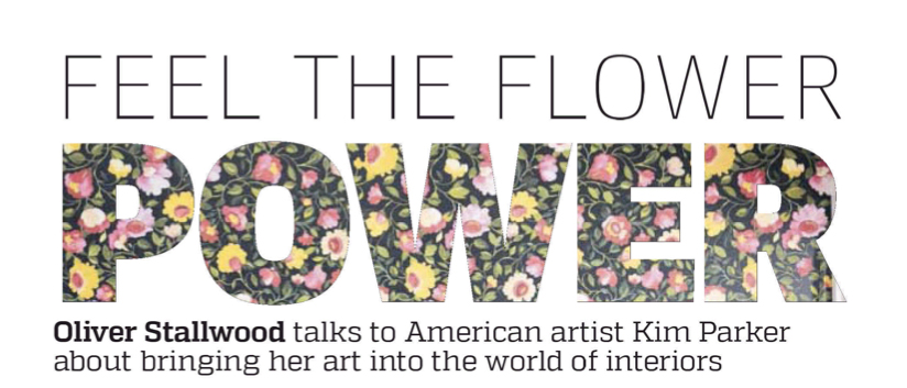
You successfully brought art into interiors. How did you achieve this?
I personally don’t really see a difference between “art” and “design” when it comes to my own work. I have always just followed this inner voice that said, “Paint from the heart.” I think when we move in the direction of the heart, good things appear and people can feel it. When I paint a textile design that becomes a rug, dinner plate, cushion or wallpaper, I am always refreshed by its new application and seeing it in a context that I may not have originally intended. With large canvases I guess it’s a bit different, but the creative process is not. My paintings and designs all came from a passion for the garden and for working with healing, exuberant color. I think these designs have found their way into people’s interiors because I believe people want to bring healing and positive energy into their homes and to wake up to a space that feels joyful.
Do you think people have art for art's sake in their home? Just sticking a print on the wall because it was cheap and looks nice?
I think everyone decorates differently; some choose paintings to match their sofas, while others select what goes up with more discernment. Whatever brings beauty and inspiration into a home, I am all for. My own walls are a pretty eclectic mix of my own original paintings; those of my late Grandmother, friends, and flea market finds. I am careful about what goes up in my own home, but I think that if some cheery art reproduction in a frame under glass is being sold at a discounted price at a national retailer, there’s sweetness to that as well. I have received many emails from people around the world who have purchased my fine art reproductions in this way and many of the stories they share are beyond meaningful to me. It’s not about the price point. It’s about hopefully bringing something of beauty into someone’s life.
How should we best use art in the home?
Bringing art into a home is an extremely personal choice. I would not feel comfortable advising anyone to decorate in the way I decorate my own space. When I see these home decorating shows where designers go in and choose everything for young couples in newly renovated interiors, I often wonder whether living with someone else’s aesthetic choices would not be unsettling in some way. I know that certain decorators have great instincts and can put a room together in a visually pleasing way, but choosing art for a home, for me, comes from an extremely personal place. I choose things that feel harmonious and I am judicious when it comes to their actual placement .I see a room as a canvas. It’s like a collage of one’s emotions, personal choices, past and present, coming together.
You live in Manhattan. How do New Yorkers approach interiors and their homes that is different to elsewhere?
There’s of course a large artistic community in New York so I don’t think there’s a real common denominator in terms of approach to or a specific style of decoration. My friends’ apartments are all very different, and no matter how small or large, serve as their aesthetic laboratories, always evolving. I think in other parts of the US there is perhaps a bit more of a traditional approach to decorating interiors. You see this on many of the design shows. People want their couches, curtains and rugs to match perfectly, like a sea of beige and earth tones, which I personally find boring. It’s a safer approach I guess. New Yorkers are not known for approaching design in this way. We are lucky because we are constantly exposed to great works of art, music, dance, and a diversity of cultures on a daily basis. These visually and culturally rich offerings certainly influence us and inspire the way we see life. I know my own home is aesthetically a bit like a mini United Nations, with Haitian and Latin American paintings, Indian tapestries, English cabinets and Danish chairs.
You say that you grew up surrounded by flower prints, and this is a predominant theme in your work. How does this relate to living in the city? Do we need more nature in our lives?
I grew up on Long Island and my Mother enjoyed gardening. We also painted flowers side by side at the kitchen table when I was little. City life has really made the subject of the garden all the more meaningful to me somehow. Because I am surrounded most of the time by concrete, I have had to create a softer place to wander. Painting flowers and creating my own gardens while living in a city is a very sweet juxtaposition of energies. My gardens are infused with city energy, but they also are expressions of a deep love and connection I have long held for Nature.
What unusual places do you find yourself getting inspiration?
Everywhere. Here again is why I have stayed in New York for so many years. You don’t have to go to a museum to feel inspired. Just walking in the street is inspiring. I see little three- year old strands of school children holding hands, and older men playing chess in the park. I see musicians on the sidewalks, and hear various languages being spoken, all music to my ears. Being surrounded by so many colors, energies, cultures, architecture and rhythm on a daily basis, I believe many of these inspirations make their way into my work. I take these influences home with me and then I kind of dump them on the table. In silence and in pigment they often surface in the most magical and unexpected ways.
What advice would you give to someone who wants to fill their own home with their own art, but maybe doesn't have the confidence?
I know people who are a bit shy about hanging their own work in their own home. I think back to the first time I ever framed a painting of mine under glass and put it on the living room wall. At the time I was dating an amazing painter of frescos whose work was actually in the Metropolitan Museum. He could capture anything with his paintbrushes. Well when he came up to my apartment and saw this painting of mine under glass, he instantly asked me. “Is this one of yours?” I was hesitant to answer him that it was until he said, “I hope so!” His were the first set of eyes on this new large work of mine, and from that point on, I think I just had more confidence in it. So my advice to someone a bit shy about hanging his or her own work on the wall is, “Hang it, and see what happens.”
You say you didn't set out to be an artist. What would you be doing instead?
I had an earlier career as a classical flutist. My family are all professional classical musicians. By the time I was eight years old I was already seriously moving towards a future in music. I graduated with a degree in Flute Performance from Oberlin College Conservatory of Music. I had fully intended to pursue an orchestral career, having learned most of the orchestral repertoire in high school and college for such auditions. I still play the flute often, and I keep myself in decent musical shape. But I now see the beautiful logic in this earlier musical foundation I was given for my life in art and design. It is from this place that my gardens dance. I have an amazingly rich sonic archive inside of me when I paint – from Bach to Prokofiev. These tonalities find their way through exuberant color and the motions of leaves and stems, through rhythms.
You are collaborating with Clarke & Clarke. What was it like working with such a quintessential British brand?
My collaboration with Clarke & Clarke is truly magical. Emma and Lee Clarke operate from the heart and are the perfect dance partners for this wallpaper and fabric collaboration. It was clear to me from day one that they understood and appreciated my work and they were not afraid of breaking with the traditional English approach to floral wallpaper and fabric prints.
In our first meeting we spent seven hours carefully looking through my massive archive together of hand painted silks, linens and paper prints. What was amazing to me then was how beautifully we all worked together over such a long stretch. We all shared the same vision and excitement of bringing healing flowers in brilliant hues into people’s homes. I am truly honored to be working with such a fine company.
And it is launching in London. How would you describe Londoners' approach to our homes and interior design?
I have been a fan of British design for ages. I think the English are the leaders and groundbreakers in design. I have always noticed that they are comfortable with taking risks, and are non-conformists and are highly imaginative. I think they have established an amazing tradition and foundation in design of beauty that serves as a kind of springboard for taking creative leaps and risks that cleverly defy that tradition, breaking ground, introducing exciting new ways of perceiving it.
What is your personal style. Any tips on the perfect home?
My personal style is to live amid rich color and harmony. I enjoy coming home to a feeling of sanctuary where color heals and brings joy into my life. I prefer warm tones like pinks and oranges, with hits of apple green, but I also enjoy the unexpected accent or infusion of dissonent color – a foyer papered in plum wallpaper like my “Caitlin” design. I think a home should be a place that embraces you, stimulates as well as calms you. I personally enjoy combining and layering pattern whether in cushions on a sold sofa, or covering a great old couch with an exuberant print. Decorating a room is like composing a symphony. You have to understand the balance and dialogue between colors, patterns and objects, so that every “voice” is heard. In my own home, I have many floral patterns, but I set them against solids, so that they can breathe, and be appreciated in their own rite. I am not a minimalist. I believe in abundance and the rich healing powers of color. I believe we should wake up to a home that celebrates and expresses the energy of life.
For more information visit: www.kimparker.tv |